Kickin - Checkout page design for reduced cart abandonment
Role Product Designer
Project Duration 1 Week
Objective
Redesign the mobile checkout flow to minimize cart abandonment by addressing issues related to cognitive load, ease of navigation, and feedback clarity.
Problem Statement
Despite a high volume of mobile traffic, there's a significant drop-off during the checkout phase. Users often abandon their carts due to:
- Overwhelming information and steps.
- Unclear navigation paths.
- Lack of immediate feedback after interactions.
Goals
Reduce Cognitive Load: Simplify the checkout process to prevent user overwhelm.
Enhance Navigation: Ensure intuitive flow with clear progress indicators.
Improve Feedback Mechanisms: Provide immediate, clear responses to user actions.
Research & Insights
Before diving into exploring better user experiences for checkout flows, I wanted to do a little research on why user abandon their carts in the first place, what is the reason for drop-offs. I came across this article by Baymard Institute which gives a nice overview of cart abandonment statistics. Reading through it, the article describes these as the key reasons for cart abandonment:
- 39% Extra costs too high (shipping, tax, fees)
- 21% Delivery was too slow
- 9% I didn't trust the site with my credit card information
- 19% The site wanted me to create an account
- 18% Too long / complicated checkout process
- 15% Returns policy wasn't satisfactory
- 15% Website had errors / crashed
- 14% I couldn't see / calculate total order cost up-front
- 10% There weren't enough payment methods
- 8% The credit card was declined
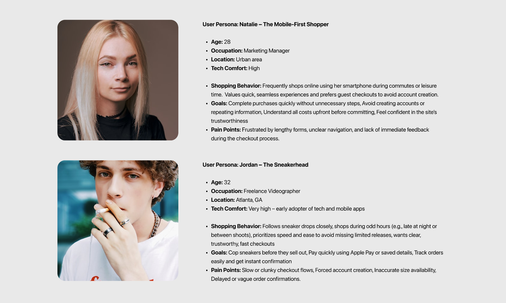
User Personas - Who is this for
Design Solutions - Cart reimagined
The idea is now to tackle the problems from a design perspective.
A. Points like these can be solved by clearly displaying costs upfront,
- 14% I couldn't see / calculate total order cost up-front
- 39% Extra costs too high (shipping, tax, fees)
B. While points such as these could be mitigated by guest checkout and shorter (3 step) flows,
- 19% The site wanted me to create an account
- 18% Too long / complicated checkout process
C. The solution for the below could be showing diverse payment methods. The approach is not to reinvent the wheel but to improve on what competitors have already begun solving.
- 19% I didn't trust the site with my credit card information
- 10% There weren't enough payment methods
- 8% The credit card was declined
Mobile design first and why
According to recent studies, over 50% of users now shop via mobile. Shopping while lying in bed or on
the couch is a norm, not an exception. This is further supported by the aritcle from Moldstud
which invites us to:
Design with thumb-friendly navigation in mind; buttons should be at least 44x44 pixels. Research shows that
70% of customers find it frustrating when they cannot navigate easily on their devices.
Approach to the design:
- Progress feedback: Users want to know how many steps are left.
- Input minimalism: Only ask for what's absolutely necessary.
- Mobile-native tools: Use autofill, Apple/Google Pay, and numeric keyboards.
- Trust & security: Secure badges, known logos, clean layout.
- Speed vs. Clarity Balance: No to sacrifice clarity for fewer screens.
User comfort
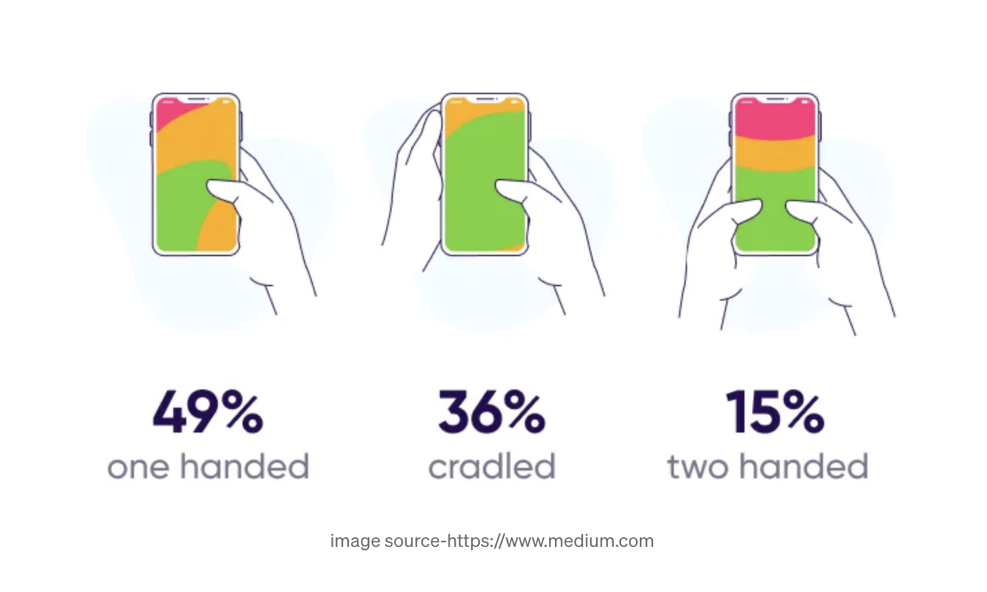
To get started designing I referenced an article on thumb zones for mobile, I then used this to overlay on my
wireframe to make sure I was hitting the sweet spot.
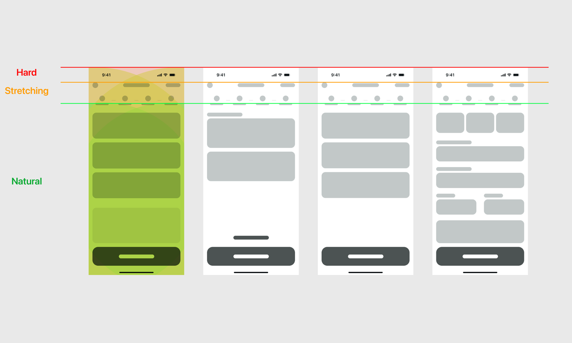
From then I proceeded with designing the high-fidelity views.
I made a few adjustments along the way. One which was adding the promo code field that would automatically
detect and apply the code. Another addition where the screen titles and a secure checkout badge to reinforce
security and a feeling of safety.
The company logo appears across all the screens so as to maintain trust and familiarity which each new view.
This is accompanied by a support chat button on the top right so the user would not have to leave the app for help.
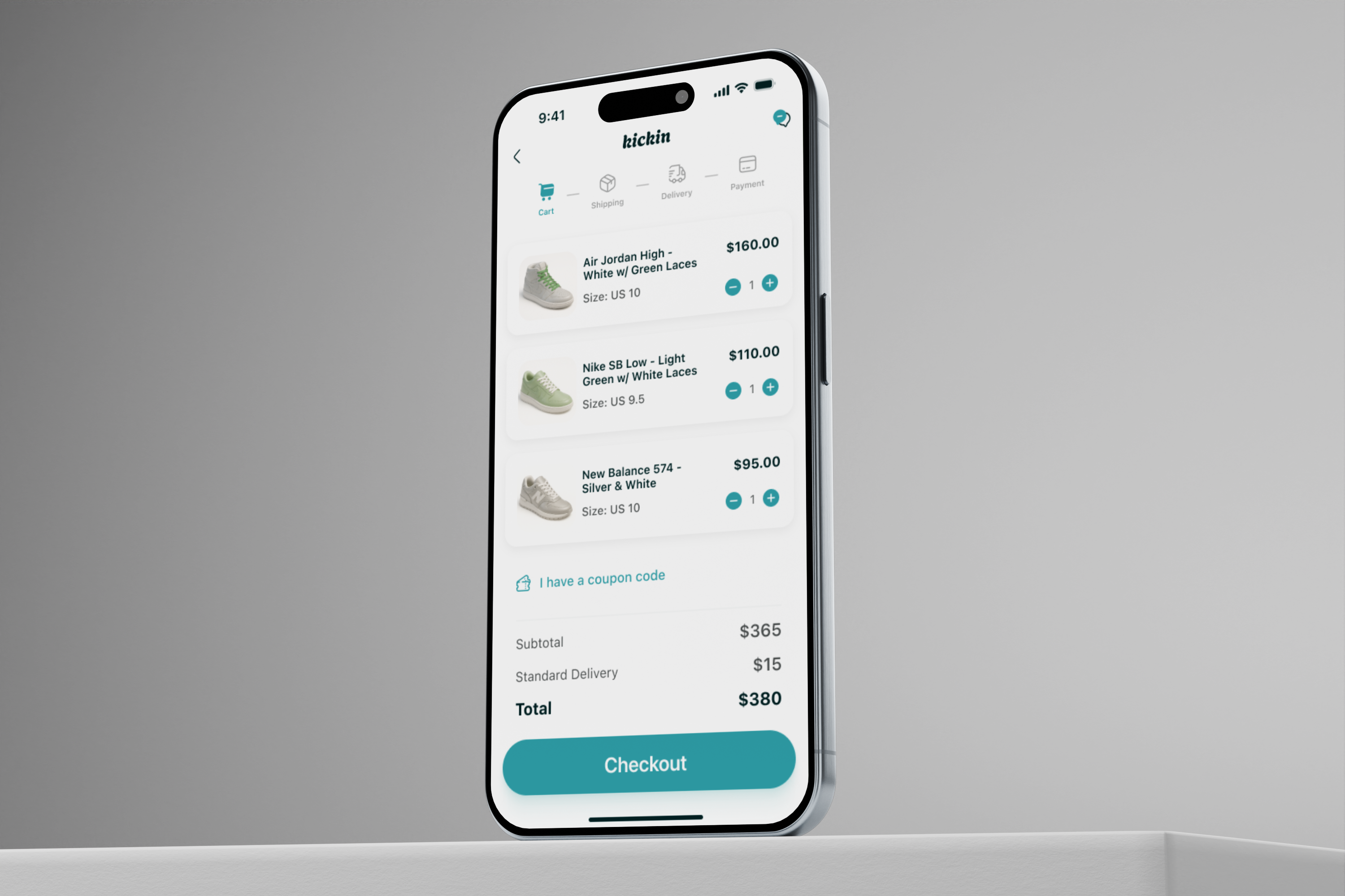
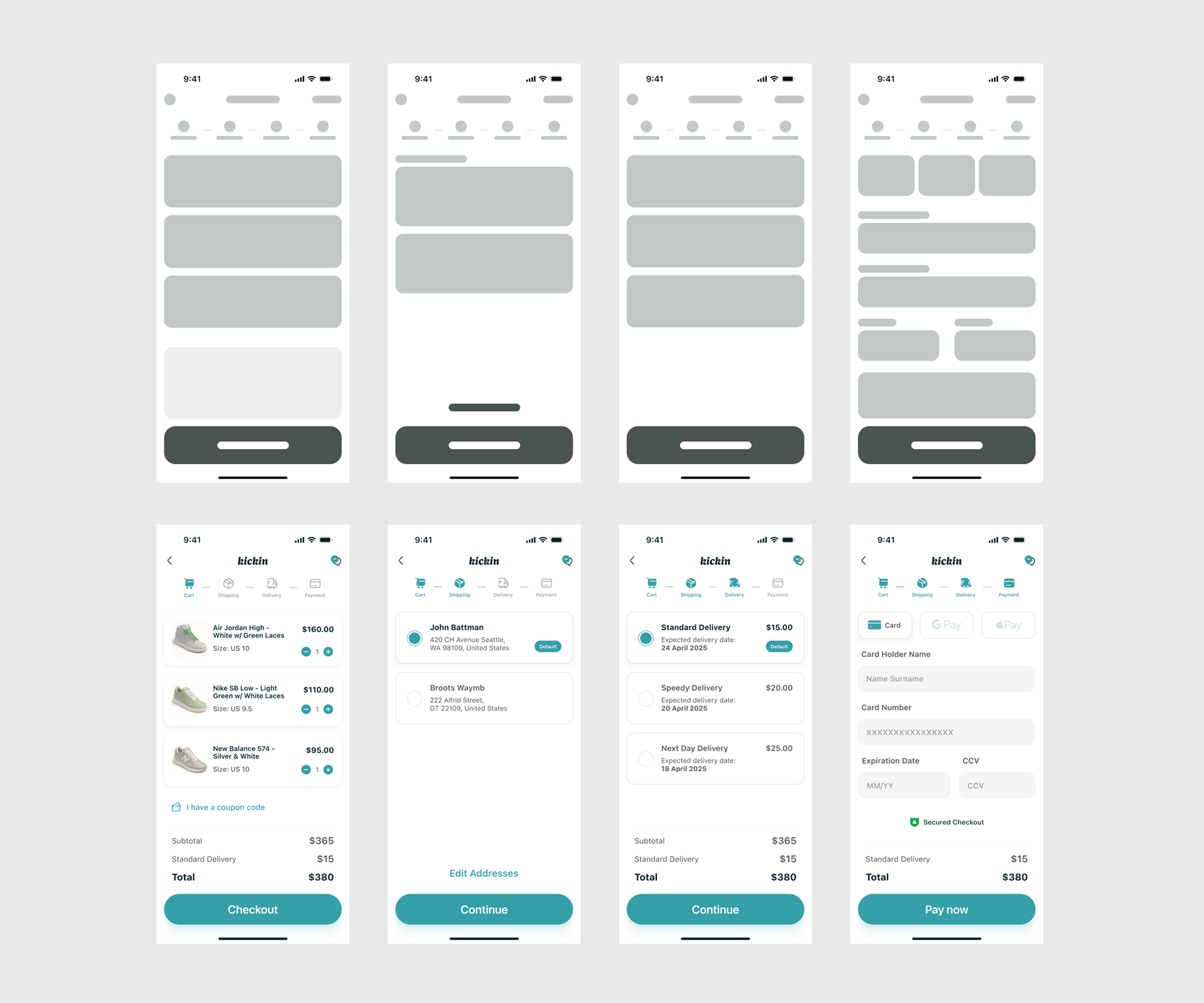
Applied Design Solutions
- Progress Indicators: Introduced a step-by-step progress bar to guide users.
- Simplified Forms: Reduced the number of fields and utilized autofill where possible.
- Immediate Feedback: Implemented real-time confirmations for actions like adding shipping details.
- Accessible Design: Ensured high contrast ratios and readable fonts for better accessibility.
Usability Testing Plan
Testing Platform:
Maze
Test Objectives:
Evaluate the clarity of the checkout flow.
Assess the effectiveness of feedback mechanisms.
Determine the intuitiveness of navigation elements.
Expected Outcomes
Cart Abandonment: Aim to decrease abandonment rates by 25%.
Improved User Satisfaction: Target a satisfaction score of 4.5/5 in post-test surveys.
Faster Checkout Times: Reduce average checkout time by 30%.
Prototype
Please feel free to try the Prototype