PRecovery - A habit recovery app designed to support users on their personal journey
Role UI/UX Designer
Project Duration 2 Months
Overview
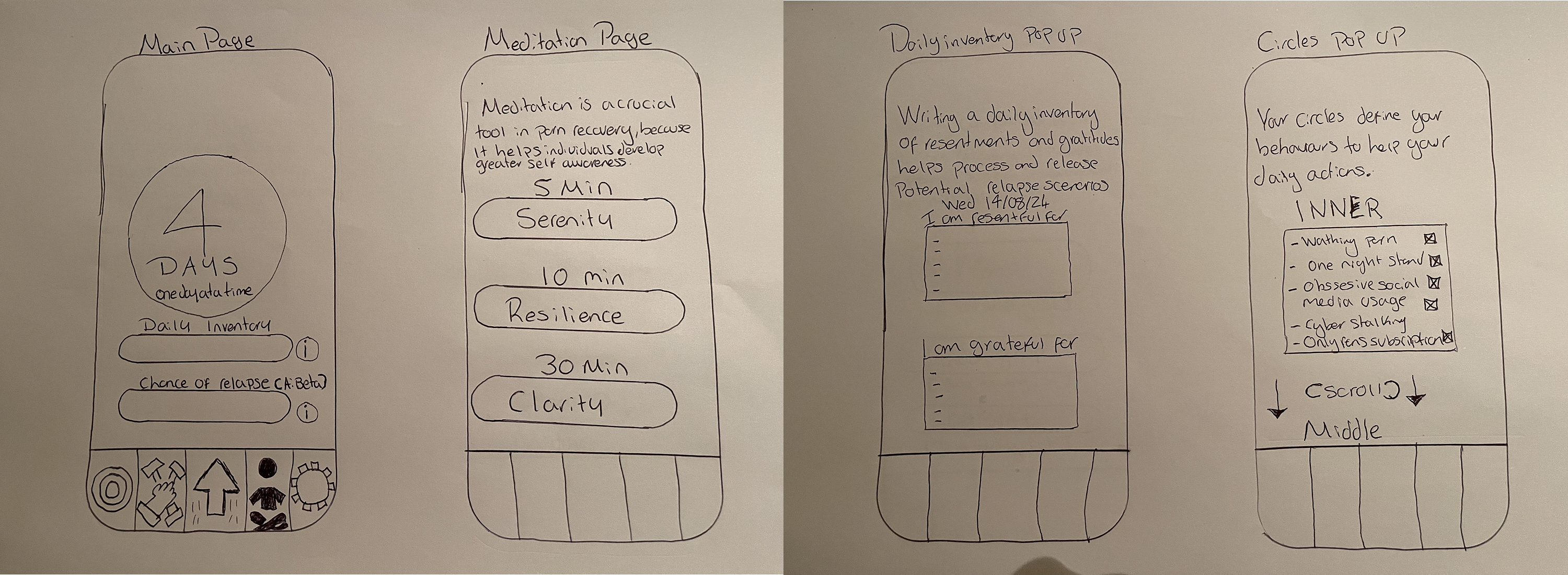
PRecovery is a mobile app which aims to help people manage habit recovery by keeping track of their daily recovery progress, and potential relapse risks. I was tasked with designing an interface and experience that felt safe, supportive, and intuitive. The client had a vision but no solidified UI/UX, and we worked closely together to evolve the app into a structured, encouraging system. We began with their sketeches (see below).
The Problem
Users struggling with bad habits (e.g., addiction, pornography, social media) often lack a discreet, non-judgmental space to track progress and monitor relapse triggers.
Design Goals
- To design daily check-ins that feel routine, not clinical
- A home screen that gives a clear picture of current risk
- A rewarding sense of progress
- Healing tools like breathing, journaling, and reflection
Design Journey
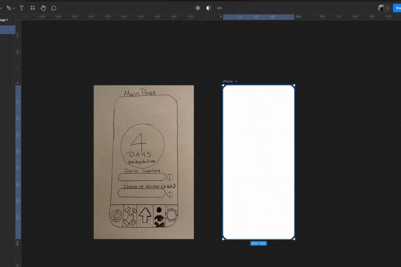
I imported the sketches that were shared by the client into Figma and used them as a reference point. Through the process I made sure to try balance the client's needs with what best serves the user.
Problem Solving Highlights
Designing for PRecovery meant prioritising emotional clarity over visual flash. Right from the beginning,
the goal was to create an environment that felt calm, discreet, and supportive but never clinical. Early
feedback showed that the relapse risk bar was difficult to interpret, so I relocated it for better visibility
and softened the design to reduce anxiety.
I also adapted quickly to evolving client needs during this project.
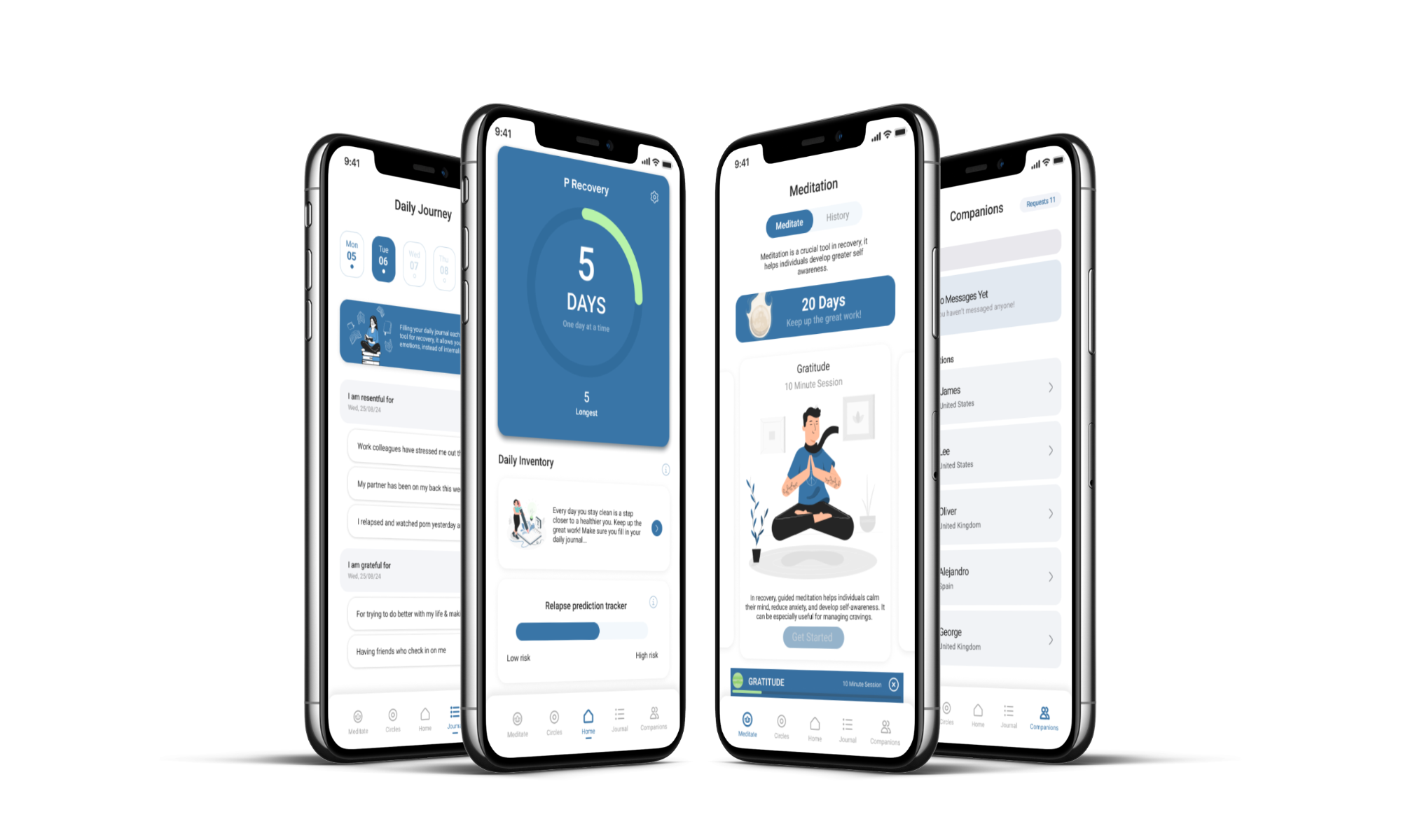
I added a clean day counter and subtle milestone animations. These were not just features, but they were
emotional cues which meant to reinforce positive behaviour. Every decision came back to one question:
Does this make recovery feel a little more manageable today? If yes, it stayed.
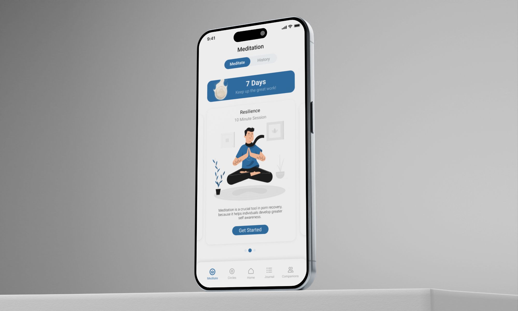
Final UI Features
One of the most meaningful aspects of this project was designing not just for functionality, but for emotional safety.
Right from the start, I understood that this was not going to be just another habit tracker but a companion tool that understood the nuance of recovery.
When the client requested more dimensionality I introduced subtle shadows, gradients and layering in ways that still kept the UI light and breathable.
Working closely with the client also meant adapting to changes quickly. New features such as the total days clean counter and modal confirmations sections
were not a part of the original scope but I made space for them because they added real emotional value for the user.
Every revision had a clear purpose:
to reduce friction, reinforce trust, and support the user through even their toughest days.
This was not about flashy visuals. It was about designing something quiet, deliberate and supportive. The kind of app that whispers “you’re doing better than you think.”
Outcome
Visual direction was praised as calming, supportive, and clean. We had further discussions about future collaboration.
“It really came together beautifully.” - Client
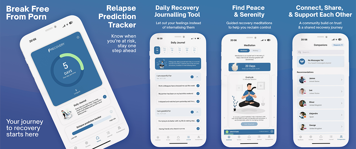
Store Images
After designing the app I then proceeded to create the app store images
Reflection
PRecovery pushed me to design not just for usability, but for emotional safety as well. It was a balancing act between giving users the structure they need and the softness they deserve.
If I were to do more:
1. I’d explore integration with therapist support or private journaling
2. Add more empty states, gamified recovery badges, or community check-ins
App
Please feel free to explore the live app on AppStore