Keep the Experience Flowing: Redesigning the WUC App for Usability and Conscious Water Use
Role Product Designer
Project Duration 2 Weeks
Introduction
Botswana’s Water Utilities Corporation (WUC) provides water services through two primary billing models: postpaid (traditional billing after usage) and prepaid (pay-before-use via smart metering). While postpaid remains widely used in Botswana, WUC is actively advancing a strategic shift toward the primary billing method being smart prepaid water metering systems, particularly in urban regions (Mmegi, 2024).
Problem ContextThe full transition to prepaid is designed to address operational challenges such as revenue loss, wastage of water and limited customer engagement with consumption patterns (BusinessTech Africa, 2025). WUC has invested significantly over P1.5 billion in modernising its infrastructure (Daily News Botswana, 2023), including the deployment of 35,000+ smart meters in Gaborone and 11,680 in Mogoditshane.
User Experience DynamicsFrom a user perspective, prepaid systems offer several advantages such as:
- Real-time tracking of water usage and balance via smart meters
- Improved financial control and better budgeting
- Early leak detection and conservation behaviour
- Freedom from expensive monthly billing cycles
However, the user experience also poses the following challenges:
- Limited recharge literacy among certain customer demographics
- Digital access barriers in rural or underserved areas
- Service cut-offs if credit is finished
- Lack of clear onboarding or usage guidance for new users (Lesira Teq, 2023)
This shifting ecosystem reveals a critical User Experience (UX) opportunity; which is to design a tailored customer experience that not only supports WUC’s operational goals (efficiency, revenue assurance, conservation) but also aligns with user needs for ease, transparency, and equity. Through user-centered research and iterative design, the aim is to uncover insights that inform a seamless and inclusive prepaid water experience.
1. Understand the Problem & Users
User Research
Launched a Pollfish Survey targeting:
- Homeowners using WUC smart meters
- Users who've interacted with both the physical token console and the mobile app
- Both prepaid and postpaid customers
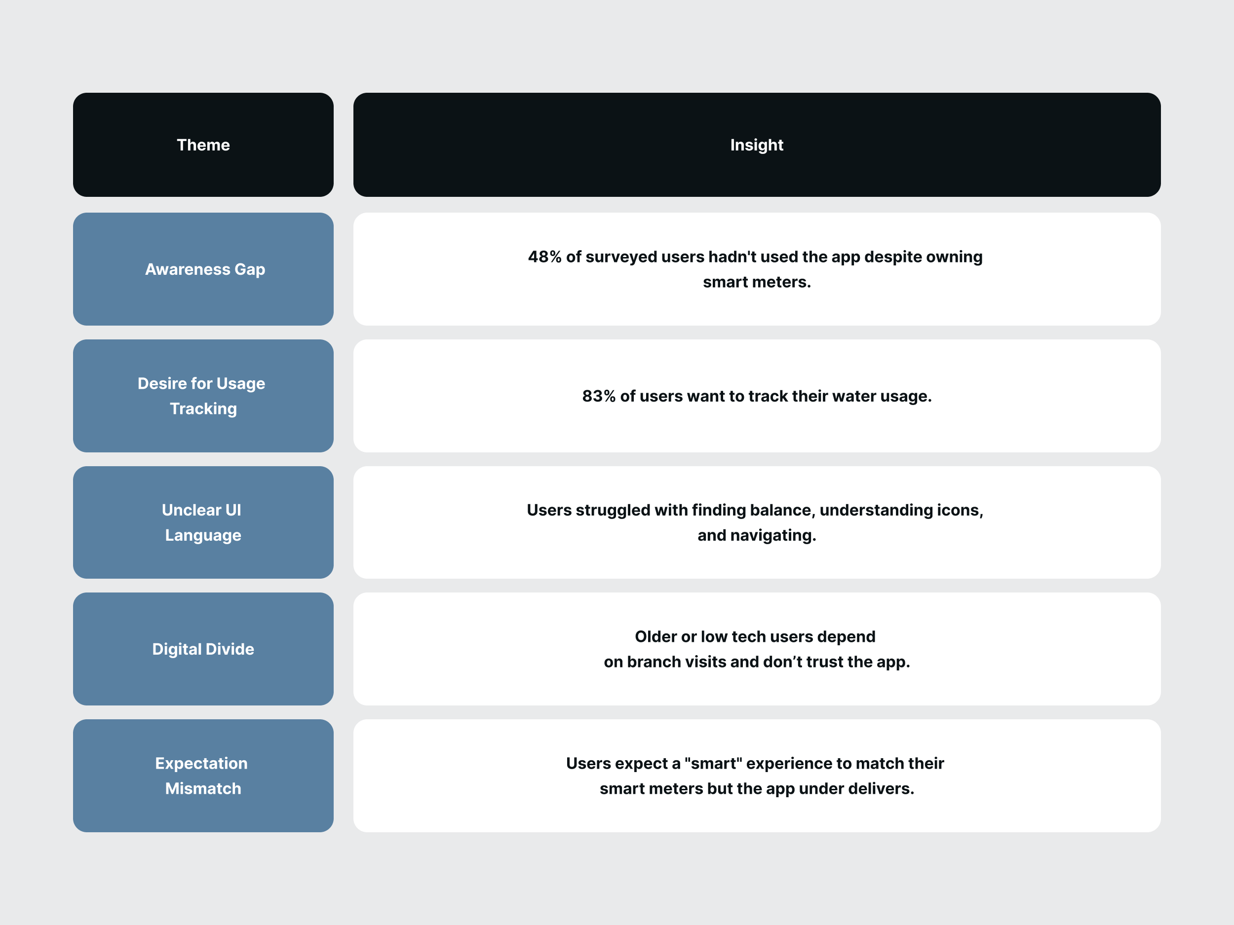
Despite WUC’s shift to smart prepaid meters, 48% of surveyed users had not used the app in the last 3 months. Most still rely on USSD or mobile wallet alternatives which reveals a disconnect between the technology rollout and actual app adoption.
User Sentiment- Navigation is confusing:
A sentiment shared by users who struggled to find basic actions like checking balance or viewing their token history. Over 50% described the layout as “somewhat confusing.”” - Features are unclear:
Many users did not know they could submit meter readings, pointing to a lack of onboarding or marketing in part of WUC. - Trust is low:
Several users still go to the branch after using the app, showing a lack of confidence in the system.
One standout finding came from Question Eleven (11), which asked users whether they would find value in tracking their water usage over time. There was a unified demand for a tracking feature. This points to a clear opportunity: Water usage tracking is not just a feature request; it is a behavioural tool users crave to manage and understand their consumption. While WUC is investing in smart infrastructure, the digital experience has not kept the same pace. There is a strong case for:
- Expanding app awareness and education, especially during smart meter rollouts.
- Redesigning the app to reduce friction, improve clarity, and surface meaningful insights.
- Prioritising features like manual water usage tracking to support behavioural change, even before full device integrations are possible.
2. Defining the Problem
Problem Statement
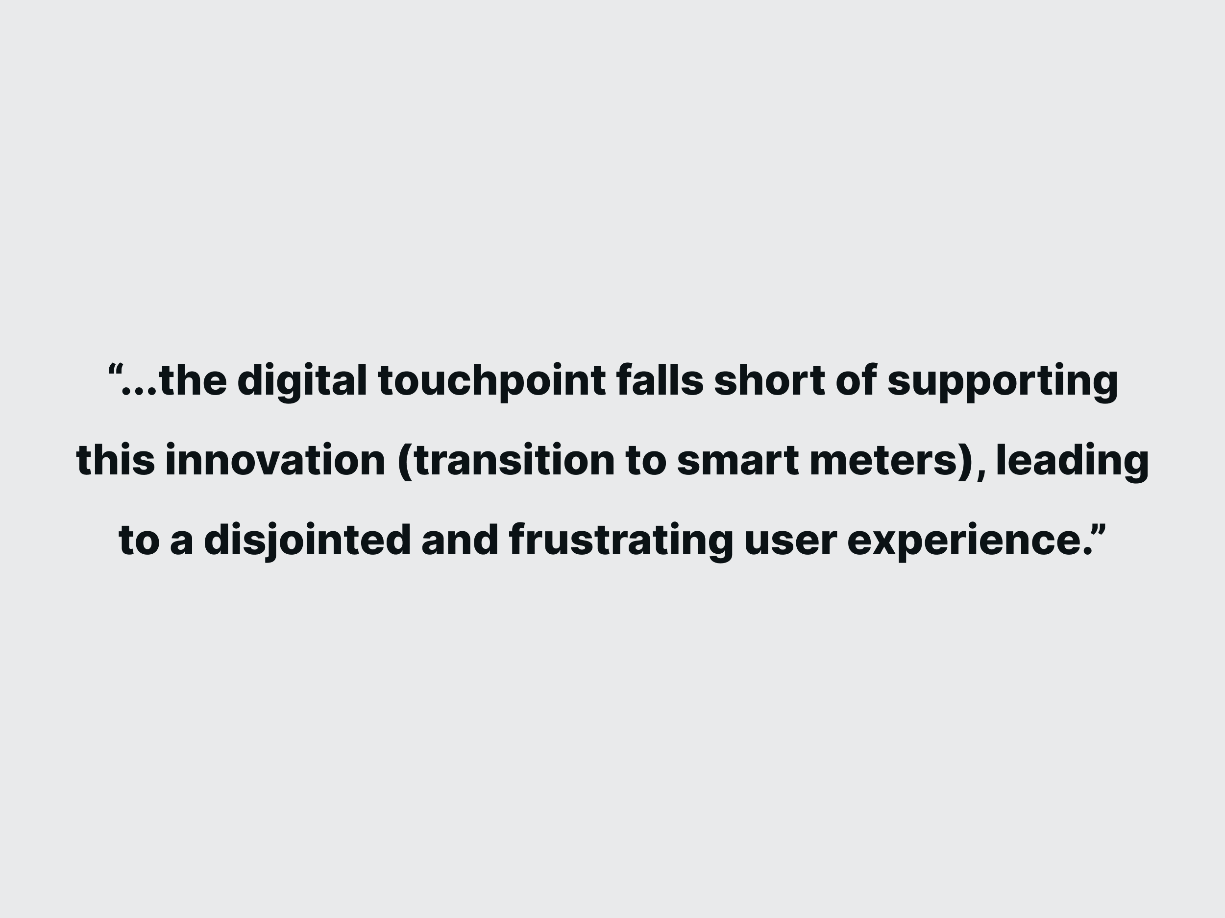
While the WUC app introduces a technically innovative prepaid smart metering system, the digital experience falls short of supporting this innovation, leading to a frustrating user experience. The app suffers from poor information architecture, user interface inconsistency, and low usability.
Affinity Mapping (Key Themes)
HMW Statements
The "How Might We" statements used to focus on solving the problem.
- HMW help users feel more in control of their water consumption through usage tracking?
- HMW support digital newcomers without making the app feel overly simplified?
- HMW create a clear, trustworthy interface that makes core actions immediately obvious?
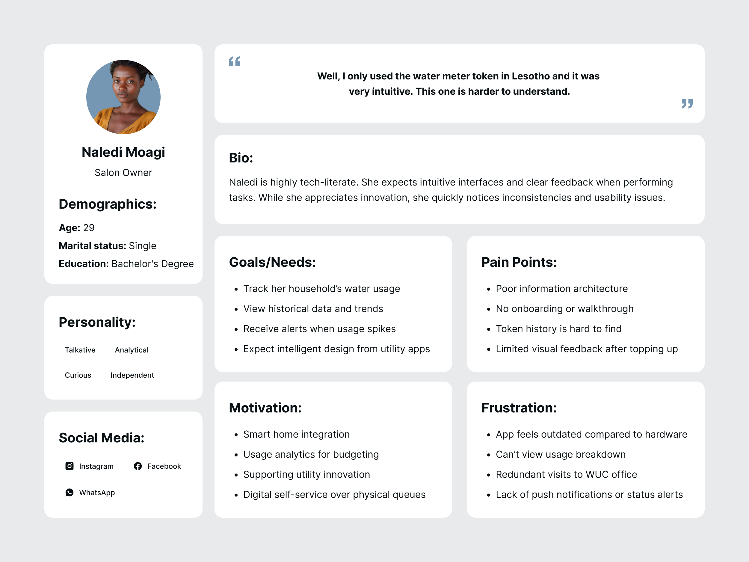
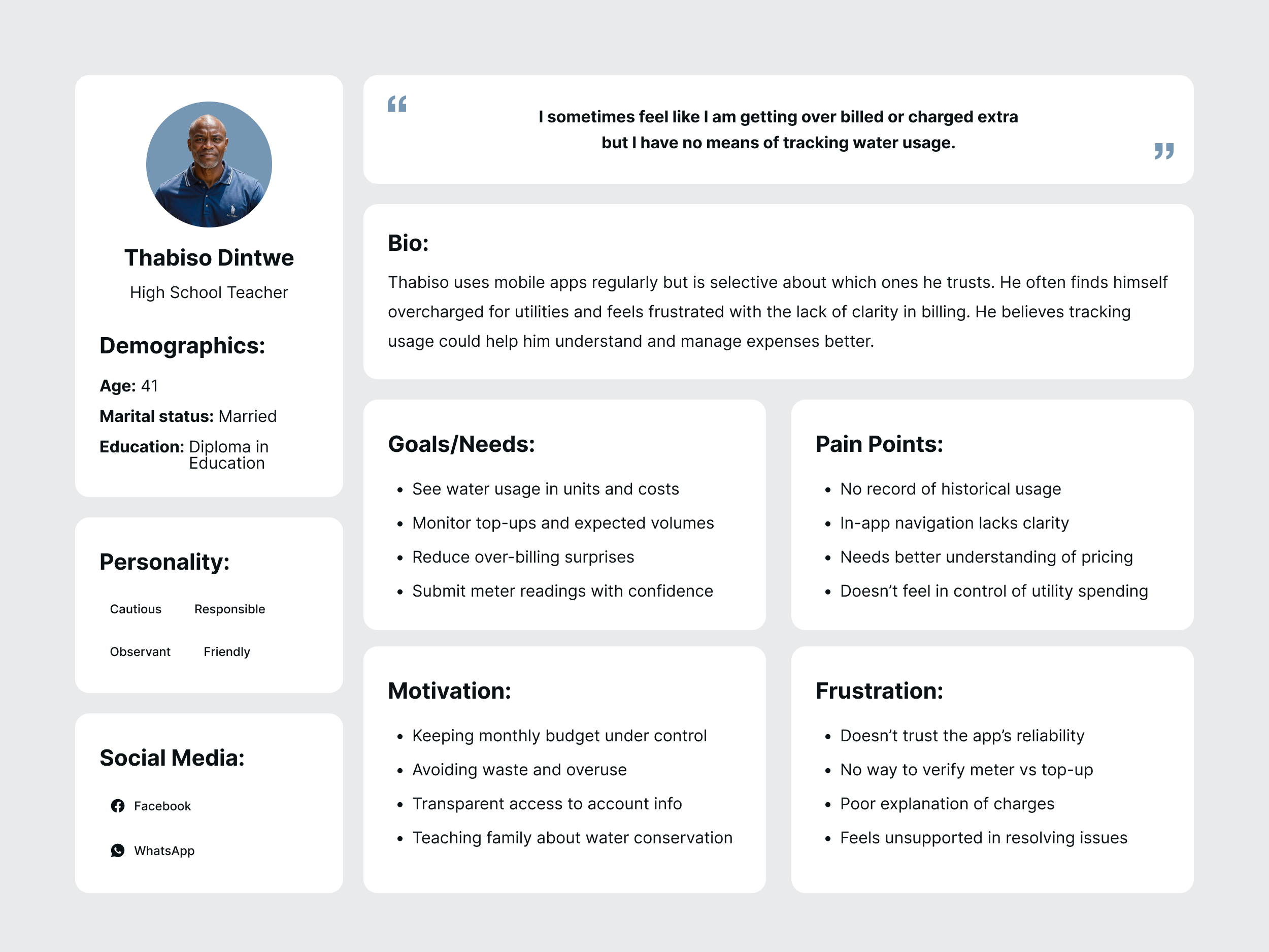
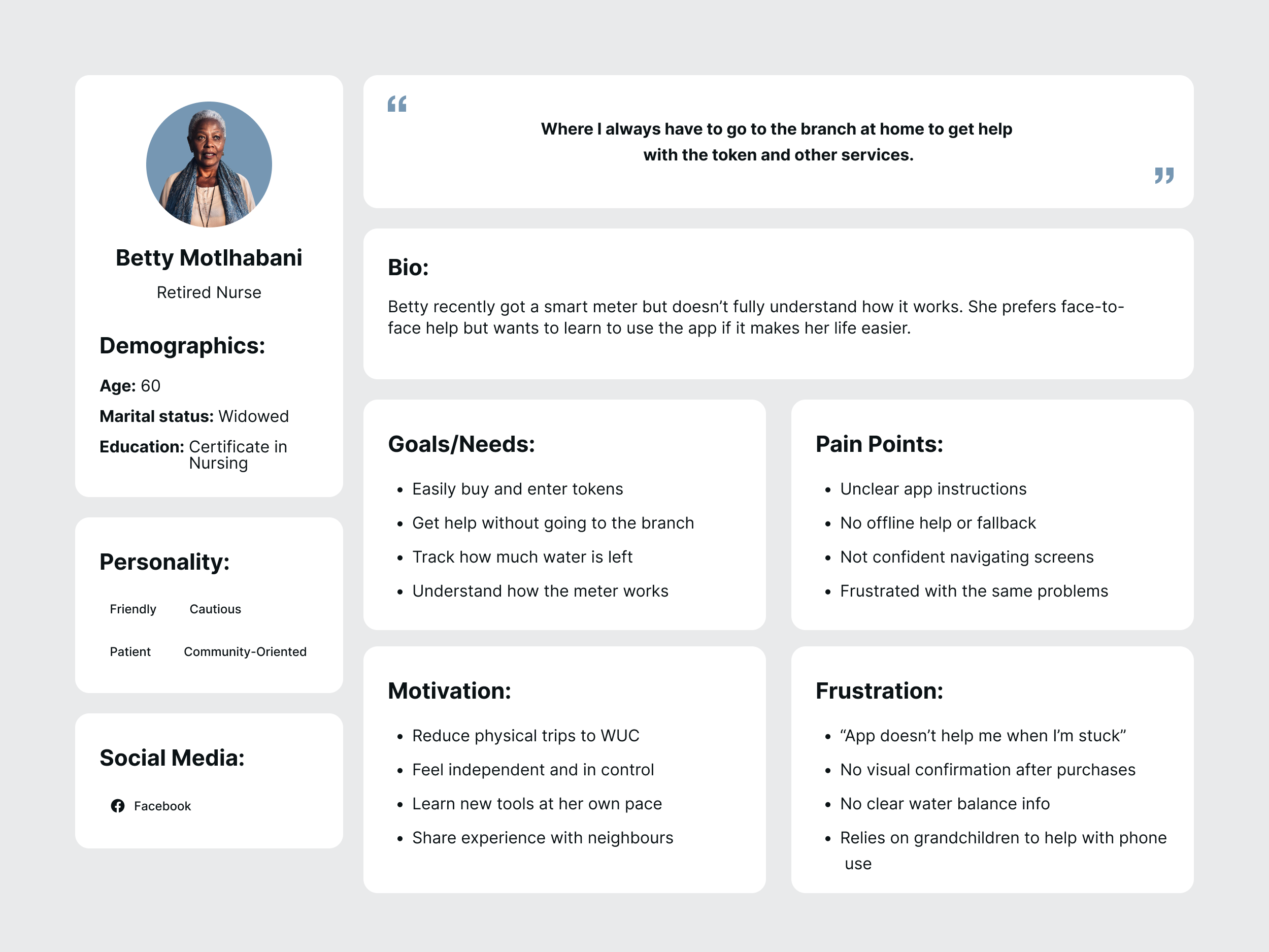
User Personas
From the research, three user personas were created. These user personas vary in age, gender and confidence in the use of technology for everyday tasks. Their profiles represent a unified sentiment of the users in the previously outlined research.
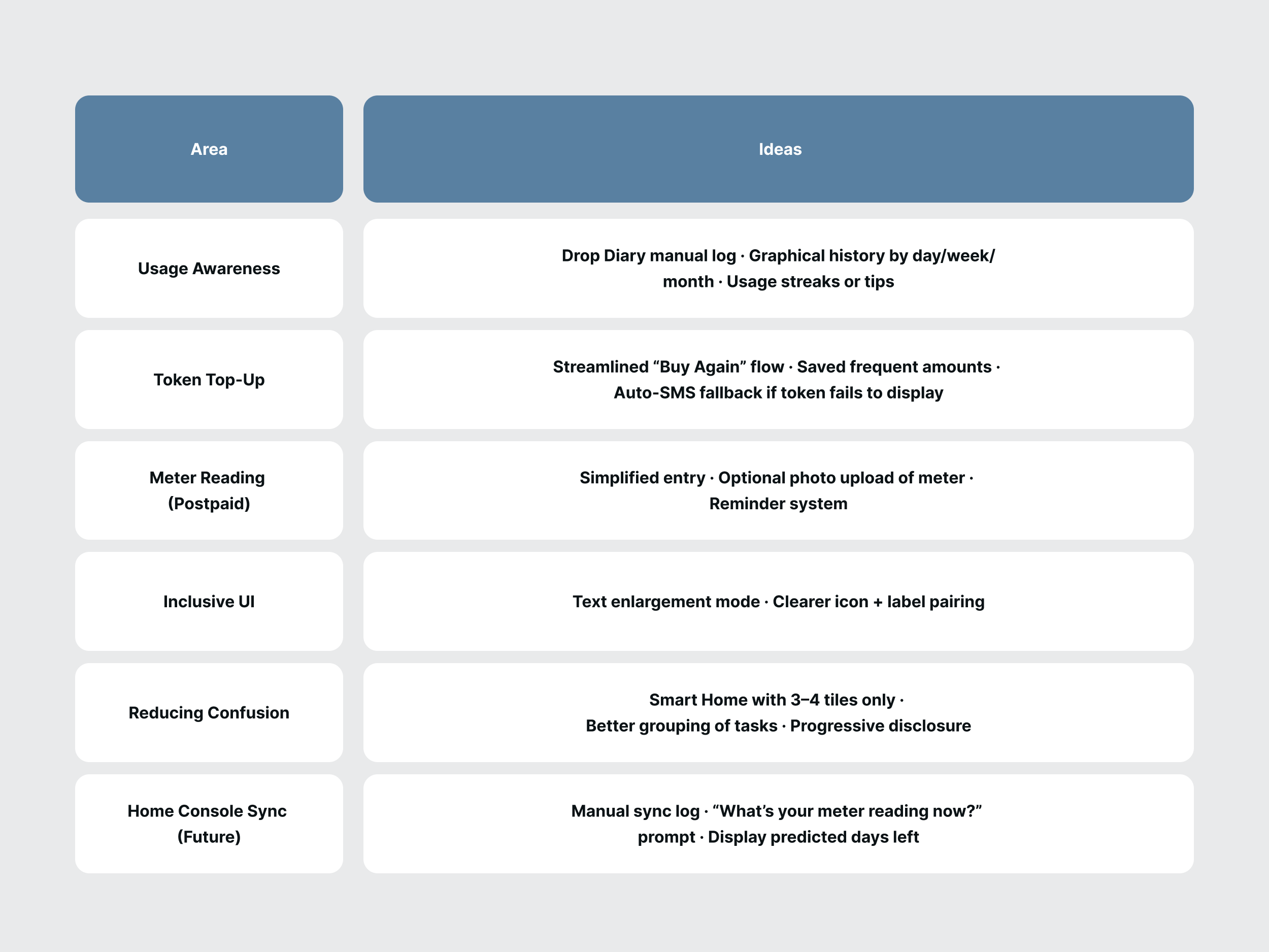
3. Ideation
Goal
Generate user centric solutions for WUC users based on real needs and expectations.
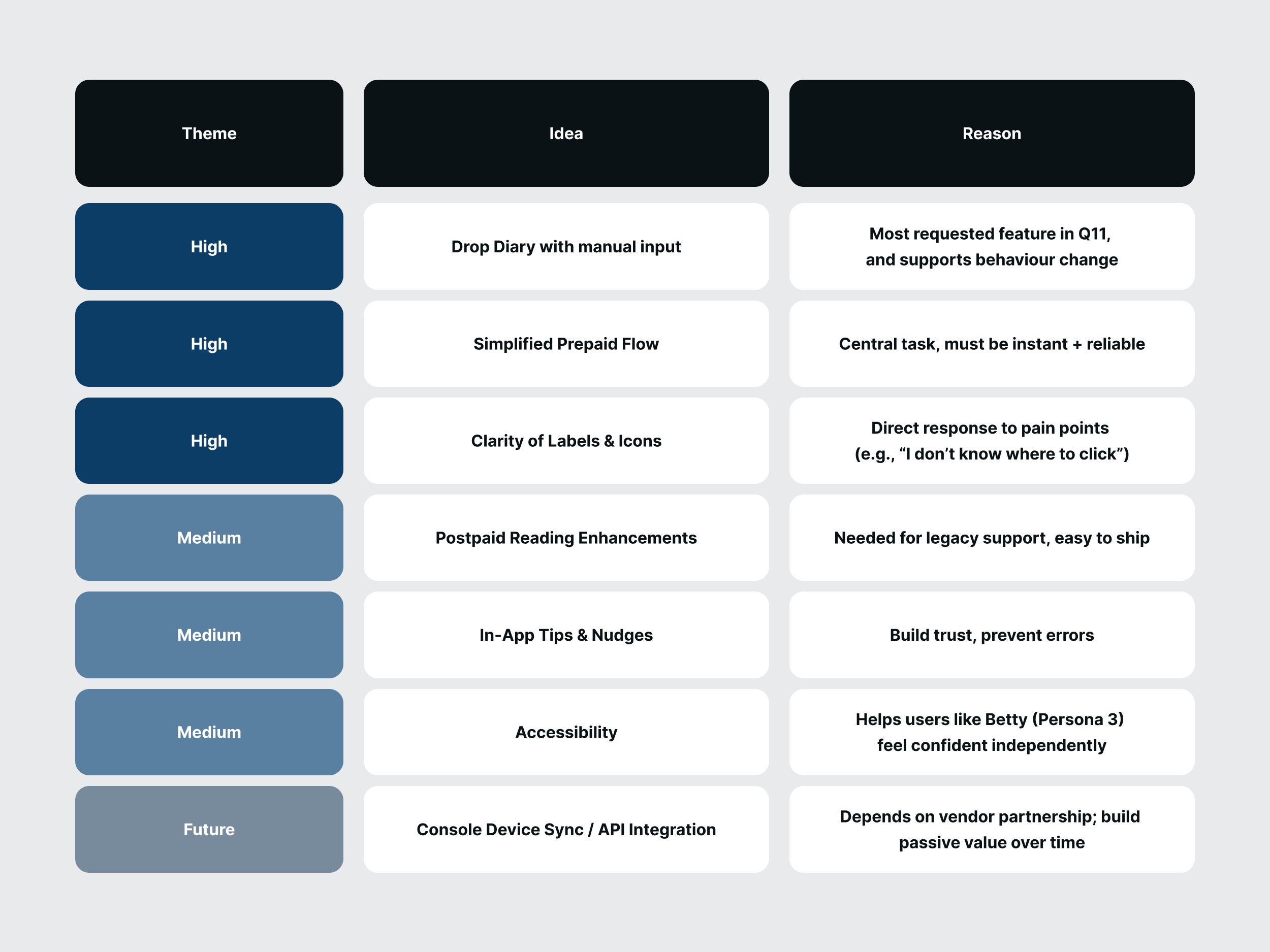
The Feature Ideas (Divergent thinking) are the ideas generated based on user demand and meeting business needs.
Prioritized Concepts (Convergent thinking) arranges the overall ideas into high priority, medium and future features.
After isolating the features to be prioritized for the first version of the app, I hired
Zakariya Buhari,
whom I met on LinkedIn. Although I have great experience in user interface design - I felt it was necessary to diversify
the ideation of this phase. Collaboration with Zakariya was to achieve this and bring in something fresh.
To start off, I shared some low-fidelity wireframes created in Balsamiq, to help visualize the features outlined
in the early ideation phase. In addition to the wireframes, I shared the user personas and a summary of the research findings.
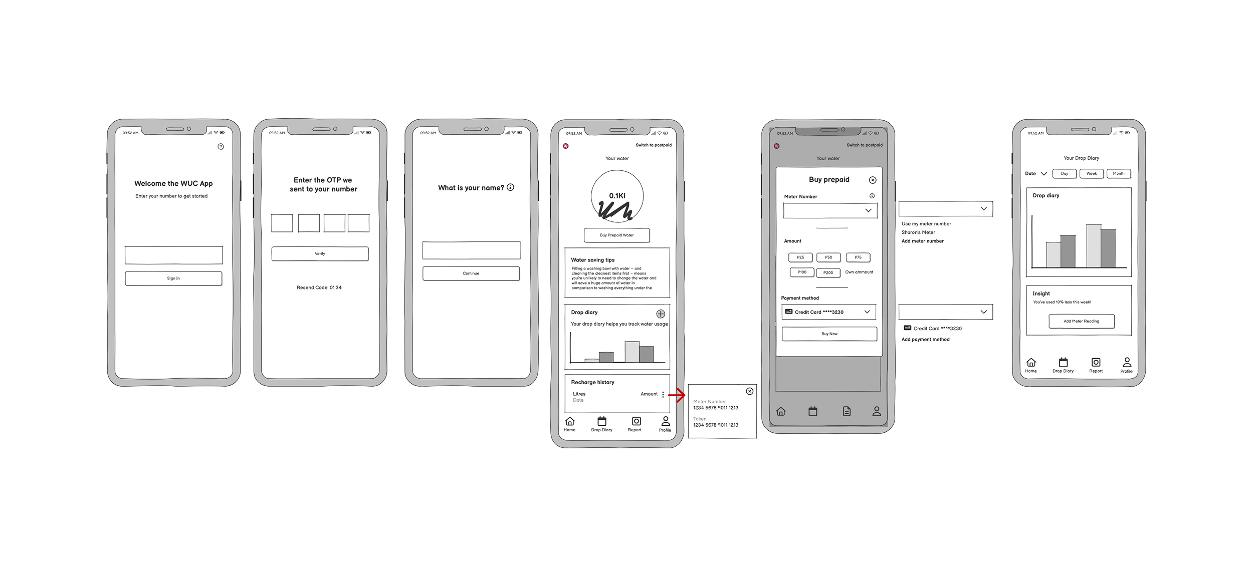
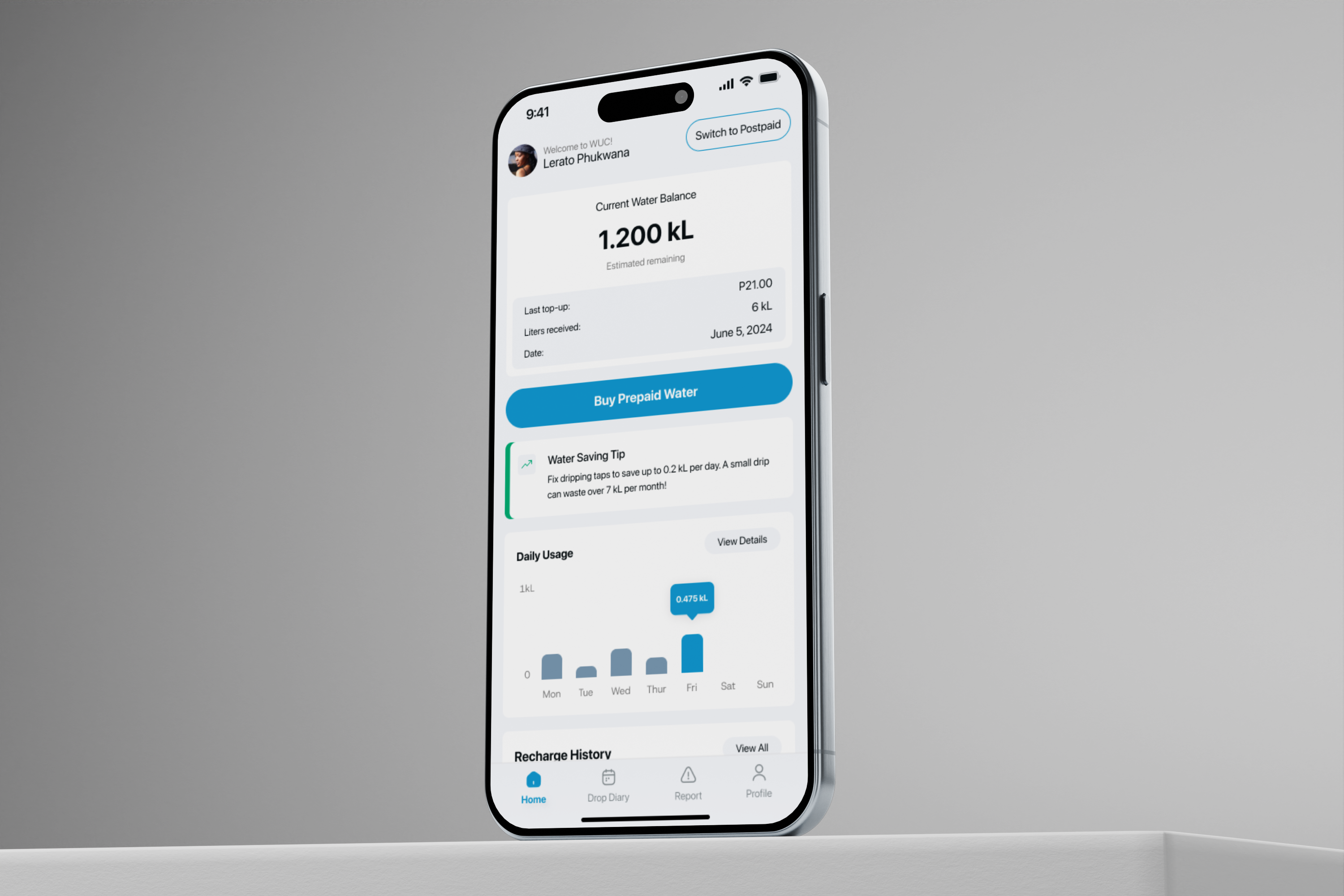
I tasked Zakariya with creating the Home Screen and the Drop Diary Screen as these would be the key focus of the
app - buying water tokens and tracking water usage.
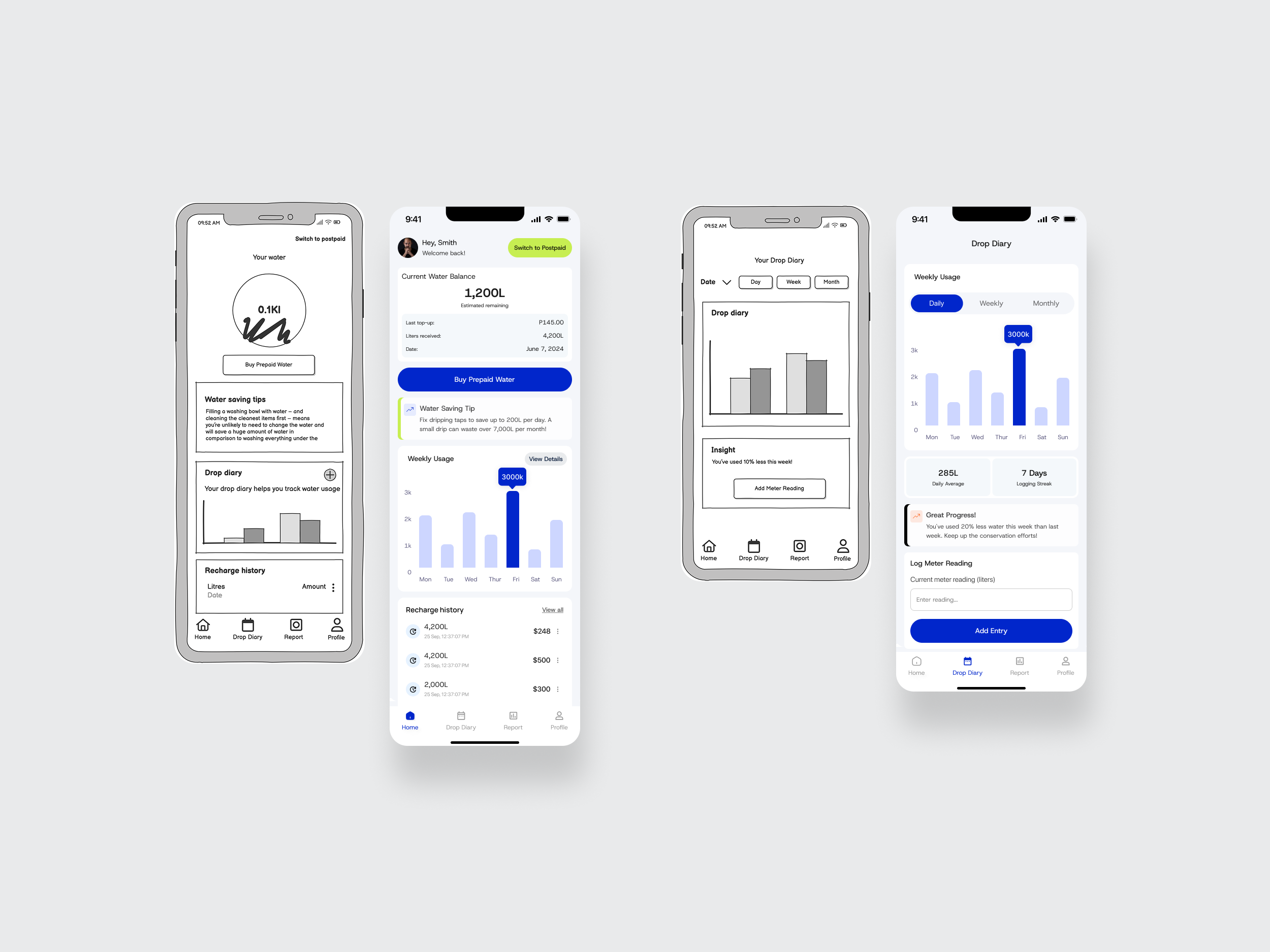
The designs I received were incredible. We combed over some of the colour options and overall layout of the screens.
The Home Screen chart was to be smaller so as to give a truly “summary” feel and not make the screen too heavy thus drawing
attention away from the insight, history or the key element - buying credit.
The green “Switch to Postpaid” Button was sticking out a little too much - and as previously mentioned, the Postpaid billing plan is to be phased out eventually, so it
made no sense to make that aspect of the app prominent. The newly designed layout caters to the complete transition from postpaid to prepaid.
Extended Screen Designs for Prototyping
We went through a few iterations to make sure the interface aligned with Web Content Accessibility Guidelines (WCAG). Although most of the soft grays were beautiful, they had to go. After revising the hi-fi wireframes, I created a few additional screens that would help flesh out the prototype and show the true vision of the solution, with its brand colours as well - the Water Utilities Corporation blue.
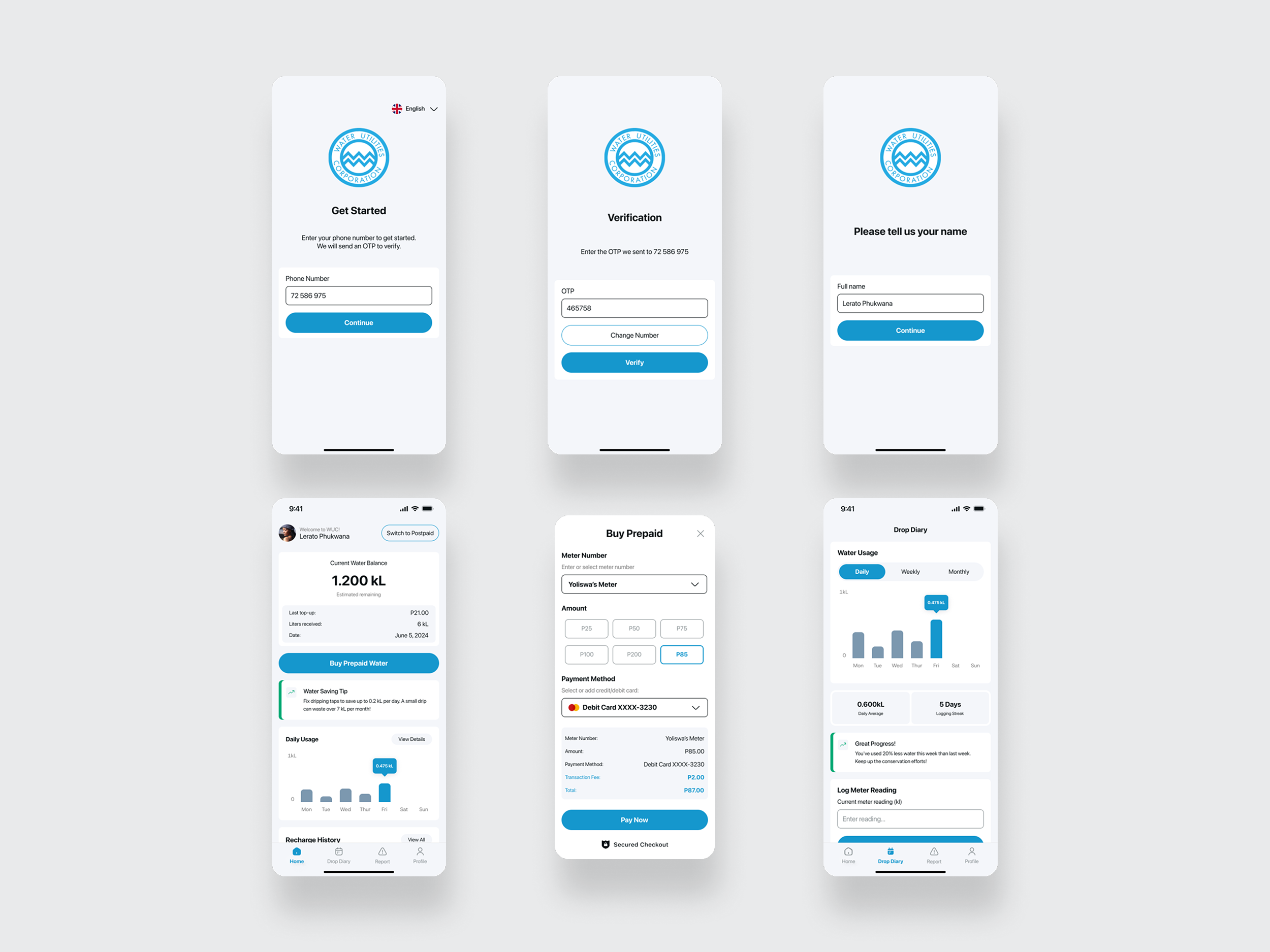
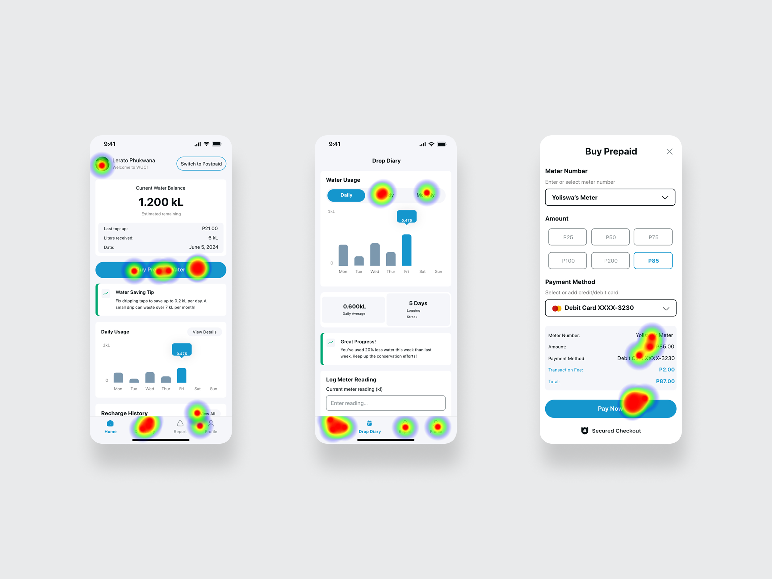
This preview of the prototype shows the steps needed to buy prepaid and how to add a "Drop Diary" entry - the two features which were highly in demand as per our research findings. The same prototype was then used in a usability test.
4. Testing
Testing Prototype Impact
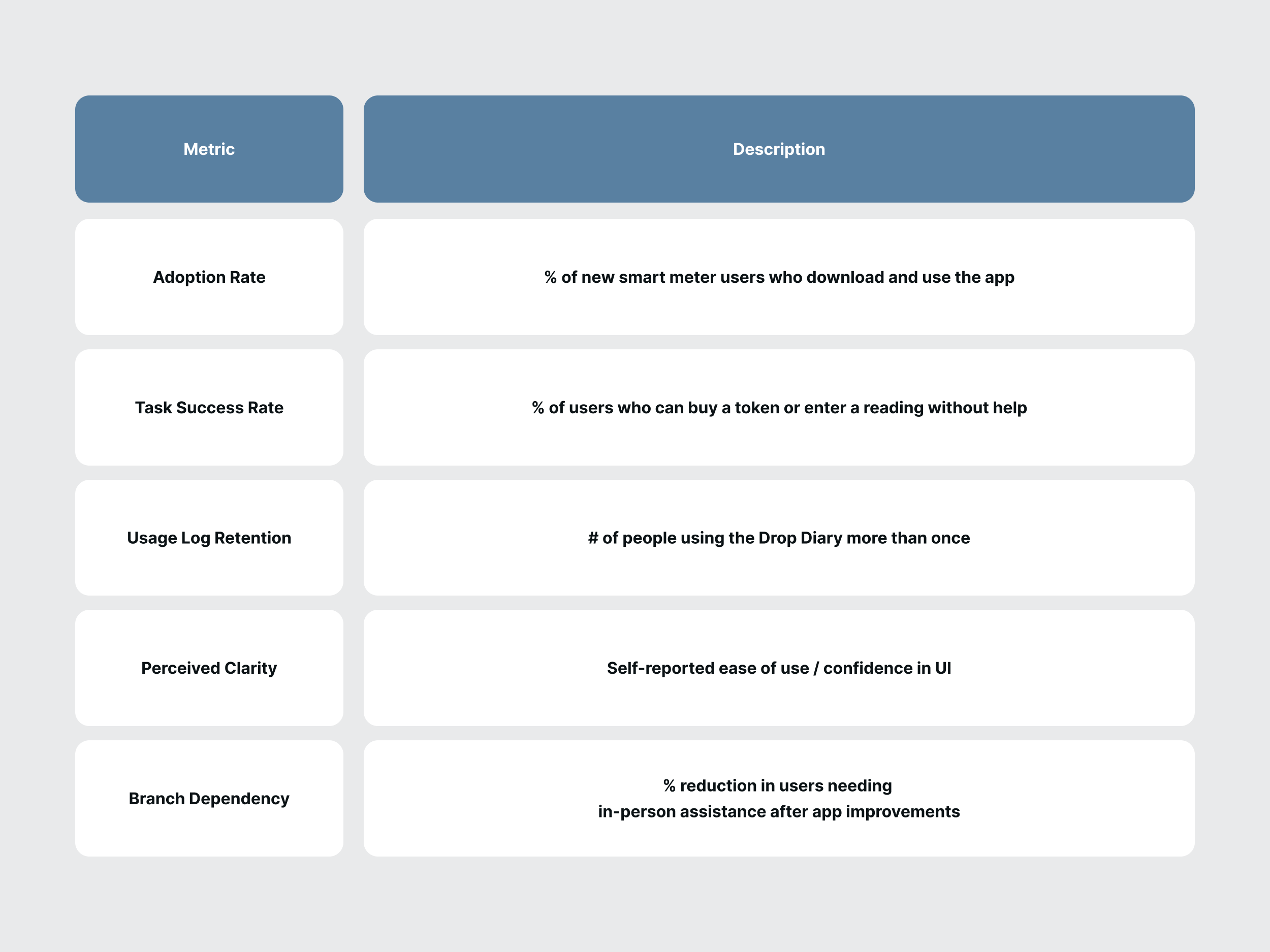
The goal of the prototype test is to validate the usability improvements, behavior changes (water tracking), and adoption potential.
Maze was the chosen platfrom to conduct the test and receive user feedback. Maze is a rapid usability testing platform that lets one
validate a prototype with real users before development. This would help; measure task success, identify experience friction and quantify the improvements.
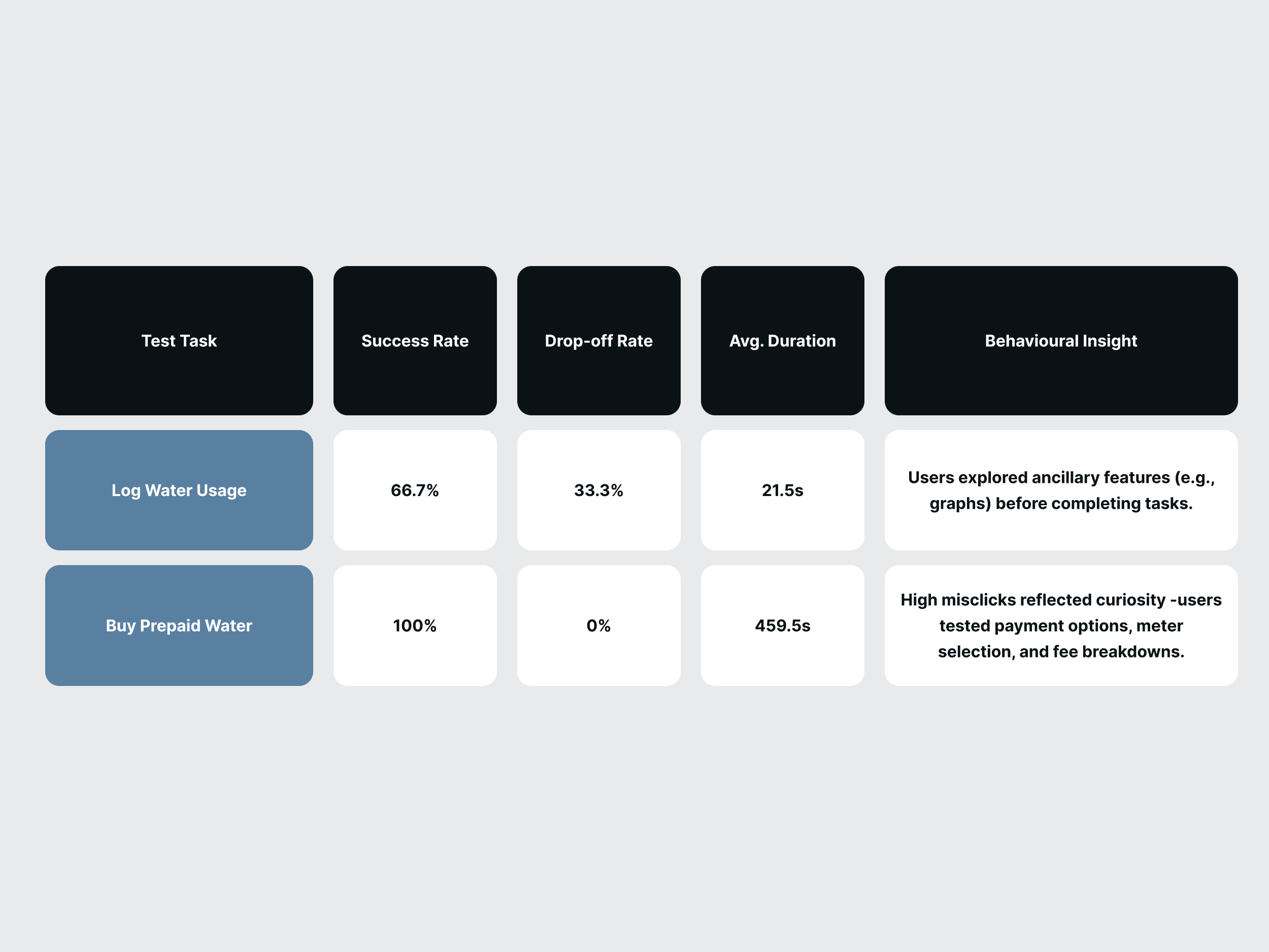
- Task-Based Testing (Usability)
"Buy a prepaid token." - Measures Success rate, misclicks, time spent.
"Log today’s water usage in the Drop Diary." - Measures completion rate, errors.
- 5-Second Tests (Clarity)
"What’s the main purpose of this screen?" - Measures first impressions.
- SUS - System Usability Scale (Overall UX)
"I found the app unnecessarily complex." (1–5 scale)
- Open-Ended Feedback (Sentiment)
"What did you find frustrating about this flow?" - Gathers qualitative pain points.
Test results
Behavioral Insights: Misclicks were Engagement Signals
The heatmaps from the test revealed some interesting information. Although the instruction were clear ("Log today’s water usage in the Drop Diary."), users showed significant interest in the functionality of the overall app. The prototype was designed to test the relevance of the two features; Buy Prepaid Water and Log a diary entry. However, the misclicks reveal a deeper interest in a fully functional solution.
1. Prepaid Purchase Flow (58.2% Misclicks)Users intentionally explored payment methods, meter selection, and fee calculations—indicating:
- Interest in transparency (e.g., "How are fees calculated?").
2. Drop Diary (17.1% Misclicks)
Misclicks occurred on graph toggles (Daily/Weekly) and streak badges, suggesting:
- Engagement with data visualization.
3. Home Screen
Users clicked on "Switch to Postpaid" (even when prepaid-focused), revealing:
- Legacy user needs despite prepaid transition.
"I clicked to see if I could pay with mobile money — it wasn’t clear, but I wanted to try!"
"The graph made me curious about my usage trends."
Misclicks were not failures, they revealed organic interest in features the test had not fully surfaced. The redesign will guide curiosity into seamless functionality.
Conclusion
Water Utilities Corporation transitioning to prepaid smart water metering represents more than just infrastructure upgrades – it is
a cultural shift in how citizens engage with a very critical resource. This case study revealed that while WUC’s technology advanced,
its digital experience lagged, leaving users confused, distrustful, and craving transparency.
Research revealed that 48% of smart meter users avoided the app entirely, relying on USSD or branch visits - not because they resisted
the innovation, but because the app failed to meet their needs and expectations. When given an intuitive prototype, users did not just
complete tasks - they explored with curiosity, clicking through fee structures and usage graphs like detectives solving a water mystery.
- Users want control, not just convenience
The demand for manual water tracking (Drop Diary) proved that visibility drives behavioural change. - Trust is built through transparency
High engagement with payment details and meter data signals a need for radical clarity. - Legacy habits die hard
Even in a prepaid future, designs must gracefully support postpaid users during transition.
The redesigned WUC app bridges this gap by transforming utility management into an empowering ritual, one where every tap, graph, and notification reinforces confidence.
Final thought:
Technology alone does not solve problems - thoughtful design does. By aligning WUC’s operational goals with user behaviors, this concept turns water accountability into second nature.